まず、この前のプログラムのところにバグ、というか出力が違ってるところがあったので訂正しました。技術系のやつですが、完璧ではないです。ごめんなさい。
で、この前のやつはcsvで吐いてエクセルで頑張ってねというわけで負け犬な感じだったのですが、Rで完結できるように関数を書きました。勉強会の資料作成もほったらかしで。できあがりはこんな感じ。
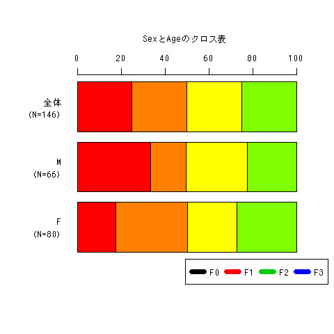
まあ、凡例と色が違ってたりとか、色自体が原色すぎるだろとかそういうあれがまだ残っているのですが、それ以外は大体目処が付いたかな。全体のやつが一番上にきてしまうのはよく分かりません。
make.table <- function(x,y,data=NULL){
  attach(data)
  row <- length(levels(x))+1
  col <- length(levels(y))
  my.table <- matrix(0,row,col)
  for(i in 1:row-1){
    my.table[i,] <- table(x,y)[i,]/apply(table(x,y),2,sum)*100
  }
  my.table[row,] <- apply(table(x,y),2,mean)/apply(table(x,y),2,sum)*100
  xname <- c()
  for(i in 1:length(levels(x))){
    xname <- append(xname,paste(levels(x)[i],"\n(N=",apply(table(x,y),1,sum)[i],")",sep=""))
  }
  attributes(my.table)$dimnames <-list(c(xname,paste("全体\n(N=",apply(table(x,y),1,sum)[1]+apply(table(x,y),1,sum)[2],")",sep=""))
       ,levels(y))
  names(attributes(my.table)$dimnames) <- c(deparse(substitute(x)),deparse(substitute(y)))
  as.table(t(as.matrix(my.table)))
  detach(data)
  return(my.table)
}

make.csv <- function(d){
  cat(",")
  cat(colnames(d),sep=",",fill=TRUE)
  nv <- ncol(d)
  n <- nrow(d)
  for (i in 1:n) {
    cat(rownames(d)[i],",",sep="")
    cat(d[i,],sep=",",fill=TRUE)
  }
}

make.graph <- function(x,y){
  png(paste(deparse(substitute(x)),"と",deparse(substitute(y)),"のクロス表.jpg",sep=""))
  my.table <- make.table(x,y)
  par(mar=c(6,6,6,3))
  barplot(prop.table(as.table(t(as.matrix(my.table))),2)*100
          ,horiz=T,col=rainbow(12),axes=F,las=2)
  par(xpd=TRUE)
  title(main=paste(deparse(substitute(x)),"と",deparse(substitute(y)),"のクロス表",sep=""))#,cex.main=3)
  legend((par()$usr[1]+par()$usr[2])/2,par()$usr[3],levels(y),ncol=4,col = c(1:7),lwd=7)
  axis(3)
  dev.off()
}

library(MASS)
attach(quine)
my.table <- make.table(Sex,Age)
make.csv(my.table)
make.graph(Sex,Age)
make.graph(Age,Sex)